- October 25, 2021
- Posted by: admin
- Category: BitCoin, Blockchain, Cryptocurrency, Investments
Introducing the Market-Value-to-Long-term-holder-Value (MVLV) and Market-Value-to-Illiquid-Value (MVIV) Bands on-chain metrics.
October 25, 2021
Defining Money
After 12 years of adoption, the concept of bitcoin as digital money is now widely known. Ironically, when learning about bitcoin, many individuals are forced to (re)consider what money is. One example of a definition that they may run into is:
Bitcoin’s digital nature allows a seamless transfer of value across space. Its 21 million maximum supply makes it dilution-resistant and perfectly scarce, also allowing it to maintain purchasing power over time — assuming the future demand does not decline. So far that hasn’t been the case.
Quite the opposite, actually. In a world that is choking on the side effects of endless money printing and ever-growing mountains of debt, bitcoin’s hard money properties give it a gravitational pull from which it is difficult to detach. The resulting adoption improves its salability and market liquidity, repeatedly opening doors for even larger market participants to dip their toes into a pool that keeps expanding.
With bitcoin currently being added to the balance sheets of publicly traded companies and even countries, an increasing number of people are trying to answer the question “what gives bitcoin value?” and thus what a fair price is.
Valuing Bitcoin
When Bitcoin was just one week old, Hal Finney became not only the first person besides Satoshi to mine bitcoin and receive the first transaction, but also the first to publicly speculate about its long-term value. By comparing its target market to a rough estimate of the worldwide household wealth, he envisioned a potential $100 trillion to $300 trillion market cap, which would give bitcoin a value of around $10 million per coin.
Since then, there have been many attempts at modeling both the short-term and long-term bitcoin price. Perhaps the most well-known models are the Stock-to-Flow (S2F) and S2F cross-asset (S2FX) models by PlanB that predict a price for the current halving cycle (2020-2024) of around $100,000 and $288,000, respectively. Although the statistical and methodological validity of either model can be debated, the models facilitated a narrative around scarcity as the central property that gives bitcoin value.
Others have attempted to predict the bitcoin price via regression models that use time as an input variable. However, the predictions of time-based models tend to vary depending on the time period that is used as input for the model, providing unstable predictions based on methodologically invalid models.
Another approach is to extrapolate futures price via statistical regression, but to adaptively value it in comparison to a baseline for “fair value” that adjusts as more information becomes available. An example of such a dynamic model is the Bitcoin Price Temperature (BPT), which attributes a relative valuation to price in comparison to its four-year average. Since the bitcoin price tends to move in four year cycles (at least historically), comparing prices to their four-year trend can help estimate how overheated or undercooled prices are. A downside of using just price is that it assumes that these trends are stable, which is not necessarily the case. Changes in market participants’ behavior can completely reverse a previously strong trend, which such purely price-based valuation models are only sensitive to after a lag.
An interesting aspect about Bitcoin is that its timechain is a public ledger of all transactions that were ever made. It provides a database about which legacy economists can only dream. In February 2017, Willy Woo first leveraged this by introducing the Network Value to Transactions (NVT) Ratio. In doing so, Woo pioneered the on-chain analysis field that has become very popular since then. The NVT Ratio compares the value of the bitcoin market to the value of all coins that are transacted weekly. Therefore, this models the bitcoin price based on one of the defining properties of money: the ability to transfer value.
Since the introduction of Woo’s NVT Ratio, Lightning Network adoption is changing Bitcoin’s on-chain footprint. An increasing amount of value is no longer being transacted directly on-chain but flows via channels on a layer on top of Bitcoin. As a result, the NVT ratio is gradually losing accuracy, creating a need for us to come up with alternative valuation methods.
HODLer Behavior As A Measurement Stick
If scarcity is a key aspect that makes a money valuable by allowing it to transfer value across time, investigating the behavior of those that have provably experienced this use case may provide meaningful insights into how it is valued by those that seem to understand it.
In March 2020, on-chain data intelligence company Glassnode made a first attempt at this. By analyzing the age of bitcoin transactions, they found that above a cut-off point of around 155 days, unspent transaction outputs (UTXOs) had a very low likelihood of moving on-chain again. Based on this, they created a metric they called Long-Term Holder (LTH) supply, which is the total amount of bitcoin that falls into this basket. In November 2020, Glassnode improved upon the metric by no longer looking at individual UTXOs, but instead utilizing (proprietary) algorithms and on-chain forensics to look at the average coin age of entities instead. They also applied a more fluid threshold for coins to age into this LTH supply.
A month later, in December 2020, Glassnode again iterated upon this concept by introducing a new metric called illiquid supply. Where the LTH supply looks at an entity’s average unspent bitcoin age, the illiquid supply looks at the entity’s spending history and classifies the entity as either illiquid, liquid or highly liquid. Figure 1 displays the circulating bitcoin supply (black), LTH supply (blue) and illiquid supply (red).
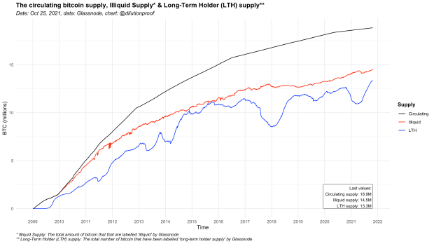
As can be seen in Figure 1, Glassnode’s algorithm for the illiquid supply appears to apply a more liberal method when it comes to classifying an entity as unlikely to spend.
Knowing how much supply is in the hands of these long-term holders and illiquid entities, we can calculate the Long-term holder Value (LV) and Illiquid Value (IV), which represent the total value of the LTH and illiquid supply (LTH or Illiquid supply * price), respectively. Since the bitcoin price can be volatile, applying a moving average over the LV and IV is helpful to better grasp its long-term trends. Figure 2 visualizes the LV and IV with a 1-year moving average that accounts for seasonal effects (e.g., seasonal effects on bitcoin mining, tax seasons, etc) on a yearly basis.
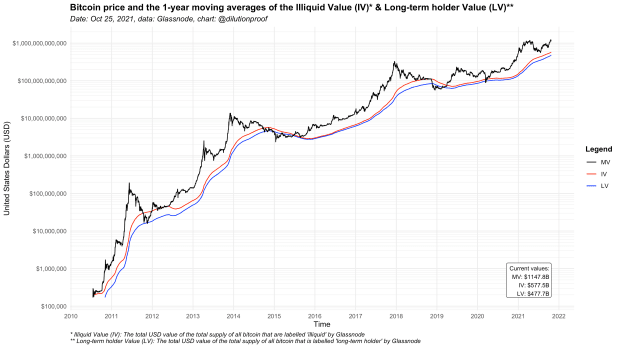
As can be seen in figure 2, the yearly average of the total value of the bitcoin supply that is in the hands of long-term holders and illiquid entities tends to be where the bitcoin price finds support during market downturns.
The reason for this can be attributed to a phenomenon called “HODLing,” which stems from a meme that finds its origin in a 2013 Bitcoin Forum post. Historically, bitcoin bear markets have proven to be tough, causing it to be declared dead 432 times at the time of writing. During bear markets, speculators that only bought bitcoin to try and get rich quick sell their coins. As a result, the market is flooded with excess supply that it may have difficulty absorbing after overly euphoric market conditions when the demand from these same speculators that drove up price falls away. Price then trends down until the low-conviction holders are all shaken from their positions and only “HODLers of last resort” remain. By holding onto their coins no matter what, this group effectively sets the price floor that was visualized in Figure 2. After all, thanks to the inelasticity of the bitcoin supply, price can only move up when there are no sellers left while there still is some demand.
Comparing Market Value To Illiquid And LTH Value
Similar to how David Puell and Murad Mahmudov created the Market-Value-to-Realized-Value (MVRV) Ratio that the anon account “Awe & Wonder” then standardized into the MVRV Z-Score, it is possible to compare the bitcoin market value to the illiquid and LTH value.
This is done by first calculating the difference between the Market Value (MV) and the Long-term holder Value (LV) and Illiquid Value (IV), respectively. That number is then divided by the standard deviation of the MV, creating the Market-Value-to-Long-term-holder-Value (MVLV) and Market-Value-to-Illiquid-Value (MVIV) metrics. The resulting MVLV and MVIV metrics therefore represent the number of standard deviations that the market value is (over)extended in comparison to the total value of the LTH and illiquid supply (figure 3).
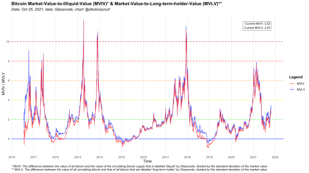
Due to the similarity in the LV and IV metrics, both fundamentally and data-wise, the MVIV and MVLV are similar metrics, where the MVIV is the most expressive. The choice to use either should be based on the degree to which one feels that coin ageing should be considered to determine whether an entity is likely to sell their coins since that aspect is more strongly reflected in the LV than in the IV.
Both metrics allow historical comparison of the overall market value in comparison to the value of the supply that is in the hands of entities that are unlikely to sell. As can be seen in Figure 3, bear markets tend to bottom out at values around 0 (which is the 1-year moving average of the IV and LV itself) and have historically topped out at values of about 8 and higher. Although the cyclicality in Bitcoin’s market valuation is mesmerizing and seduces many to assume that history will repeat, there are no guarantees that this (four-year) cyclicality will necessarily continue.
MVIV And MVLV Bands
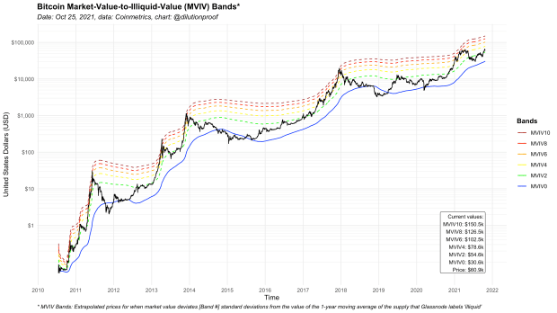
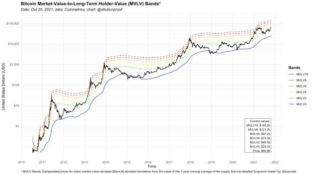
Now that we have a metric that quantifies the relative valuation of the bitcoin market in comparison to the value of the LTH and illiquid supply, it is possible to map the bitcoin price at each respective MVIV/MVLV level on top of the price chart, allowing us to graph how much room for growth or decline there is for price to reach certain MVIV/MVLV levels again. This was done before with the BPT Bands and MVRV Bands that were discussed above.
This is done by adding a multiple of the standard deviation of MV to the IV or LV itself, where the multiple represents the MVIV/MVLV value that you want to visualize. The resulting numbers are then divided by the circulating bitcoin supply to get the valuations per bitcoin. When plotted on top of the price chart, these values represent the “Bands” in the MVIV Bands and MVLV Bands concepts that are visualized in Figures 4 and 5, respectively.
Comparing Floor Models
With the MVIV and MVLV Bands added to the mix, we now have four bitcoin valuation models that each use different baselines to estimate its “fair value.” Figure 6 displays the baseline values of the MVIV, MVLV, MVRV and BPT Bands models.
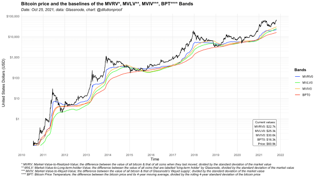
As can be seen, the MVRV Bands baseline is the most responsive, since it is the only metric that does not include a one-year (MVIV & MVLV) or four-year (BPT) moving average component.
While relevant, that does not necessarily mean that it is the superior model to rely on. As can be seen in Figure 6, the baselines of both the illiquid and LTH supply value are currently above that of the MVRV, which has historically only briefly occurred late 2014 and late 2018 during peak bear market conditions, and never during a market uptrend towards all-time highs as is currently the case.
An explanation may be that a shift in how the world sees bitcoin may be happening. As can be seen in Figure 7, the trends for the percentage of the circulating bitcoin supply that is not on exchanges (blue) or that is labelled illiquid (green) have dramatically changed since roughly March 12, 2020.
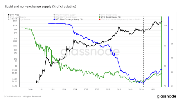
On that day, global financial market sell offs triggered a cascade of long liquidations that took the bitcoin price down over 50% in two days and cleared the market of all excess leverage. Since then, publicly traded companies and now even a country have adopted bitcoin, while central banks have turned on their money printers heavily in their attempt to combat the economic downturn, creating a gigantic asset bubble instead.
In a time where bitcoin is making strides to replace gold as the go-to hard money shelter against monetary inflation, an increased adoption of bitcoin as an asset to transfer value over time means that coins become less likely to move on-chain. That trend may be exacerbated by Lightning Network adoption, which reduces the need to transact on-chain even further. As a result, unspent transactions may take more time to realize value via an on-chain footprint as is quantified in the MVRV metric. Simultaneously, their likelihood of being included in Glassnode’s illiquid or LTH supply increases.
If these trends continue, it is possible that the MVRV baseline will start lagging and that the presented MVIV and MVLV metrics may provide a more reliable estimate for the bitcoin floor price. It is therefore nice that we now have multiple similar options to fall back on that utilize this valuation method from different angles. For the time being, these metrics are very similar — especially when the bitcoin market value deviates further from the respective baselines (Figure 8).
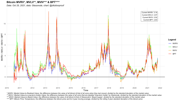
The similarity between the floor models that are depicted in Figure 7 and the resulting metrics of Figure 8 can also be seen as a form of confluence. The MVRV, MVLV and MVIV all incorporate the lifespan of the underlying coins. These metrics therefore reflect investor time preference and hold valuable information about the relative bitcoin valuation in comparison to the price floor that is set by HODLers.
A limitation of the presented MVLV and MVIV Bands metrics that we need to be cognizant of is that proprietary algorithms were used by Glassnode to construct the illiquid and long-term holder supply metrics. It is likely that Glassnode will keep improving upon those algorithms to optimally service their clients, which would mean that both future and historic values may be subject to change over time. Charts representing MVIV and MVLV (Bands) metrics therefore should be seen as a snapshot in time that uses the most up-to-date method to quantify the supply that is in the hands of entities that are unlikely to spend it, and not to be compared to prior visualizations of the same metric.
At the time of writing there is no web-based version of the metric available yet (Glassnode’s Workbench currently does not support an expanding standard deviation), but the R code for the metrics and charts presented here is available on GitHub.
Special thanks go out to @Anoi30604540, @_Checkmatey_ and @WClementeIII for providing feedback on the draft of this article.
Disclaimer: This article was written for educational and informational purposes only and should not be taken as investment advice.
This is a guest post by Dilution-proof. Opinions expressed are entirely their own and do not necessarily reflect those of BTC, Inc. or Bitcoin Magazine.
